Hat Tip:
Christian Lowe @
DefenseTech.orgNote: I would have published earlier but I had sent this out for a ‘peer review’ of sorts. Special thanks to Don Meaker at Pater’s Place for taking the time to review this over his holiday. Of course, any errors that remain are my own. --Thanks again Don!
DefenseTech was way out in front of a pack of media sources when it posted two pieces (see
here and
here) about a recent “Extreme Dust Test”, that the Army conducted on the M4 and three other ostensibly ‘competitor’ rifles. The summary of results as provided in the article were ‘interesting’ to say the least, and I was particularly struck by the near instantaneous eruption of reader comments calling for radical action and remedies that came from readers on both the posts. At the time, I believed the calls were clearly unwarranted given how much was unknown about the testing. I made a comment on the second article stating that I would defer forming an opinion on the results of the test until I had more data in hand. I
wrote:Frankly, having been a reliability engineer, and without verifiable complaints from the users in the field, I would not form an opinion on this until I studied the supporting data. For starters, I'd need to know the failure distribution,the specific conditons under which the failures occurred, and failure modes ('jam' is a failure, a mode is a 'how' that has a 'why') to even begin to understand if there is a problem, and if there is a problem is it with the weapon or the way it is employed.
If there is a problem, is there a fix that is easier and cheaper than buying new weapons?While history is rife with examples of Army 'Not Invented Here' syndrome, unless there is good evidence that Army weapon evaluators WANT to field problem weapons, I see no reason to doubt the testers at this time.
Well, from the subsequent response to my cautionary note, one would think I had called for dissolution of the infantry! The M16 (and derivatives like the M4) have brought out more personal opinions and controversy than perhaps anything else in weapons acquisition (for any service of any scale) except perhaps the 9mm vs. 45ACP pistol arguments. I think that the M16/M4 actually IS the most controversial issue of the two, because it usually inspires rhetoric on two fronts: reliability AND stopping power. Both controversies are rooted, I believe, in the fact that there is nothing more personal to the warrior than the weapon the warrior wields – and there are a lot more warriors with rifles than tanks, aircraft or ships.
I decided to cast about for more information, but there really isn’t a lot of public and available information that is attributable to an either authoritative or verifiable source. Among a lot of rather alarmist and inflammatory articles and postings (just
Google “M4 Dust Test”) I found little objective reporting and only a few tidbits not already covered by DefenseTech that were ‘seemingly’ credible (if unverifiable), such as
this piece from David Crane at Defensereview.com.
So, you want some (unconfirmed/unverified) inside skinny i.e. rumor on the latest test, something you most likely won’t find anywhere else, even when everyone else starts reporting about this test? Here ya’ go, direct from one of our U.S. military contacts—and we're quoting:
"1. Because the HK416 and M4 were the only production weapons, the ten HK416 and M4 carbines were all borrowed 'sight unseen' and the manufacturers had no idea that they were for a test. The 10 SCARs and 10 XM-8s were all 'handmade' and delivered to Aberdeen with pretty much full knowledge of a test. (The SCAR even got some addition help with 'extra' lubrication)
2. With the HK416, 117 of the 233 malfunctions were from just one of the 10 weapons.
Interesting stuff! ….and credible, given that only the HK416 and M4 are in ‘full production’. But like I said: “unverifiable” by me at this time. (Later on we’ll see some things that tend to support Mr Crane’s ‘contact’.)
None of the information ‘out there’ was of use in determining answers to any of the questions that I had posed in my original comment, so I had reluctantly set the idea of further analysis and moved on. That is, I was moving on until
Christian Lowe, the author of the original DefenseTech articles generously asked if I was interested in a copy of a ‘PEO Soldier’ briefing that he had been given. Of course, I said “yes please!”.
After dissecting the briefing, I still have more questions than answers -- some of which the answers to may never be released. The answers the briefing does provide are more philosophical than technical (But all things considered, that is alright with me).
As it is, the briefing provides some insight into what the Army was doing and how much importance we should place on the results -- given 1) where the Army is in its test efforts and 2) to what end it hopes to satisfy in performing these tests. I think it also points to the some of the things the Army is going to have to do in the future to get the answers it needs.
I have decided to present and parse the briefing, with my analysis of the data contained therein, slide by slide. I will limit my discussion and questions to ONLY those details surrounding the test articles, test conduct, test design, and test results that can be determined with certainty. I will speculate as little as possible. But when I do, it will be stated in the form of an opinion supported by the facts in hand or be presented as a posing of a question that the briefing or testing raises in my own mind, and will not be given as an assertion of fact.
Overall Briefing Impressions
Before getting into the details of the briefing, let me provide my initial observations on the brief as a whole. First, from experience in preparing this kind of presentation I can tell it was specifically tailored for Executive/General Officer review originally. If this briefing wasn’t intended for that purpose, I’ll bet the person who put it together usually does it for that purpose. The ‘tell’ is found in both the organization and level of detail provided. Much more detail and the briefer would be chewed out for wasting time, and if there was much less detail the briefee would see too many open issues and the briefer would be thrown out for not being prepared. There are elements of the briefing that make it clear it was intended for someone not familiar with the nitty-gritty of testing or data analysis. I think it is a tossup whether those details were provided exclusively for public consumption or to provide perspective for a potentially nervous ‘operator’. The brief is organized to tell the audience five things in a fairly logical flow:
1) what they were trying to accomplish,
2) what they did (1 and 2 are somewhat intermixed),
3) what was found,
4) what it means, and
5) what comes next.
The brief intermixes the first two ‘a bit’ and I would have arranged the information slightly differently. I suspect the briefing is slightly pared down for public consumption than in its original format (you will see a revision number in the footer of the slides). There is only one slide I think that I would have composed very differently and I will go over why when we see it later in the post. I hereby acknowledge that my preference may be due as much to Air Force-Army service differences as anything else. The slides are data heavy, with a lot less gee-whiz PowerPoint than what you’d find in an Air Force brief. In has, in other words, typical Army style and content.
The presentation totaled 17 slides and was created on 12 December 2007. Slide 1 is simply the title slide: “Extreme Dust Test” and Slide 17 is a call for questions. The meat of the briefing in between these slides will now be discussed.
What They Were Trying to AccomplishSlide 2: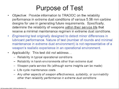
The first thing that strikes me about the ‘Purpose’ slide is that there is no mention whatsoever that, as it has been reported, this particular test was performed to appease any ‘outside’ concern. Whether this relationship is omitted out of convenience or perhaps even not true, we cannot determine from the briefing. What IS clearly stated, is that the Army is collecting information to help generate ‘future requirements’. So perhaps this effort to develop new requirements is the first step in response to a certain Senator’s
call for a competition prior to acquisition of new rifles?
Most interesting is the point that this test is an adaptation of an earlier ‘lubricant test’, and that it is an ENGINEERING test and NOT an OPERATIONAL test. In subsequent slides we will see that this is clearly the case, and one wonders what useful data the Army hoped to gain from performing this test, beyond learning how to use it as a starting point: the beginning of designing a meaningful dust test. It must be noted that both the reuse of a deterministic test design already in hand, and the purpose “to see what we can see” is completely within the analytical character of the Army, which has been noted and described by the late Carl Builder (who in many ways admired the Army most above all the other services) in his 1989 book
Masks of War (Chapter 10).
Under “Applicability’ on this slide is a list of what this test did NOT address. in only a roundabout way does this slide state that the only real information they expected to acquire was related to ‘reliability performance in extreme dust conditions’. And nowhere in the brief is it stated or implied that the Army was expecting to get definitive answers with direct implications in the operational arena. As we will see later, this was not as much a ‘functional use’ test as it was an ‘abuse’ test.
To my ‘Air Force’ mind, this test and analytical approach doesn’t really make a lot of sense unless the results are specifically for use in designing a meaningful test later. So I again turn to Builder who summarizes in
Masks of War (at the end of Chapter 10) the differences between the questions the different services ‘pursue through analyses’:
Air Force: How can we better understand the problem – its dimensions and range of solutions?
Army: What do we need to plan more precisely – to get better requirements numbers?
And thus it does appear that the test objectives are wholly within a normal Army analytical approach, so I’ll take the reasons given for the test at face value.
My Interpretation of the Army Objectives: “We intended to reuse a test we had already developed for another purpose to gain insight into only one facet (dust exposure) of weapon reliability by testing weapons in conditions well beyond what would ever be experienced in the field and if we learn something we will feed that knowledge into future requirements”.
What They Did
Slide 3
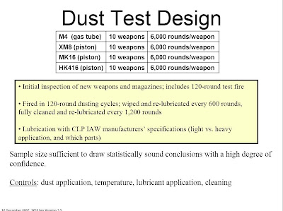
There’s a couple of things on this slide that leap out at the viewer. First and foremost, while the test has been described as a “60,000 round test”, that is a somewhat misleading and imperfect description. More accurately, it should be described as 10 trials of a 6000 round test performed using 10 different weapons of each type (later on we will find reason to alter the definition further). I assume that when the Army calls it ‘statistically significant’ they have the data to support that firing 6000 rounds through a weapon (apparently to a system’s end-of-life) is a meaningful benchmark. And that performing the test 10 times on different weapons is enough to meet some standard (and unknown) statistical confidence interval. The second thing that leaps out is the simplified list of ‘controls’, knowing there are a host of potential variables in any test involving human input as well as a lot of other material variables to be controlled (like using common lots of ammunition and lubricants) as possible confounding factors. The human variable in any experiment is difficult to control which is why test engineers strive to automate as much as possible. I suspect the large number of rounds fired per test is designed to ‘average’ the human variability as much as anything else.
Slide 4
I found this slide highly illuminating as to the nuts and bolts of the test. First it clearly shows the level of dust buildup on the weapons: a solid coating that would be impossible to collect on a weapon being carried: I guess you hypothetically could find one like this in garrison until the CSM came around. I don’t believe it would be a leap of faith to assert that just carrying the weapon would tend to clean it up and make it cleaner than what you see here. Second, the slide shows a technician/tester firing a weapon from a bench setup. Can you imagine the tedious repeated firing of the weapons using selective fire in this environment? Now I am also wondering how did they control the timing/gap of the ‘resqueeze’ sequence on one magazine and between magazines? How sensitive is each weapon design to continuous cycling, and how does that relate to the operational need? Is the human operator more adept at clearing some malfunctions than others? How many operators fired and reloaded each type of weapon? Did they rotate responsibilities among the different weapon types to remove any operator variables? (I told you there would be more questions than answers).
Slide 5  “Slide 5” is kind of an intermediate summary chart to tie all the information already given to the briefee in slides 2,3 & 4 and place it in front of them one more time before showing them the results. This is not a bad idea in any briefing, but especially sound if you want to keep misunderstanding out of expectations and reactions.
What Was Found
Slide 6  This slide is the first indication to me that there was possibly a slide or two removed for this particular audience, because this is the first reference given to the “Summer of ’07” test in the briefing.
I believe the difference between the M4 results in the Fall and Summer ‘07 M4 tests is the most significant piece of information in the brief, because that disparity calls into question the entire test design as well as its execution. If dissection of the test event conduct (for either try) identifies no ‘smoking gun’ errors that would explain the reason(s) why on the second go around for the M4, the C1 & C2 Weapon stoppages were 4+ times greater, C1 & C2 Magazine Stoppages were 60+% higher, and the total of the two as well as Class 3 stoppages were nearly 2 times higher, then I would suspect that the test design itself is flawed OR the variability of the units under test is far greater than anticipated. The only way to decide between the two without other data is to perform repeated testing, preferably again on all the weapon types, to determine if there is an identifiable pattern/distribution of outcomes. I would be surprised if the Army didn’t have reams of other tests and test data to use in evaluating this test and eventually determining this point, but just from the data presented here, I don’t see how the Army could reach ANY firm conclusions on the relative or absolute performance results, and from the ‘barf box’ at the bottom of the slide it looks like they are scratching their heads at this time.
I’m still bothered by not knowing the relative ratios of Class 1 and Class 2 malfunctions and the ‘open ended’ time limit of the Class 2 definition, because you could have (for example) 100 Class 1s at 3 seconds downtime apiece and that looks as bad as having 100 Class 2s that are 30 seconds downtime apiece. The number of malfunctions is important as a single facet of performance, but the number of malfunctions times the downtime for each one is the TRUE measure.
Quantitatively, because the test is suspect due to the non-repeatability of the M-4 data, all you can say about the total malfunctions so far is that the M4 had many more times the failures than the other carbines THIS TIME (again, in conditions well beyond what should ever be experienced in the field).
Slide 7  Well in the previous slide, we’ve seen the first breakdown of failure modes in the discrete identification of ‘magazine failures’. Slide 7 is the breakdown for the ‘weapon’ failure modes. Immediately we can tell the M4’s did much worse than the other systems in 2 of the 8 modes: Failure to Feed and Failure to Extract. The M4 experienced a slight relative deficit in the Failure to Chamber category as well (perhaps that ‘forward assist’ feature is still there for a reason eh?). The lack of information concerning the distribution of failures among the weapon types is a crucial piece of the puzzle and is missing throughout the brief. If the failures are caused by uneven quality control in the manufacture, handling or storage process versus a design problem, it would probably show up in the distribution of failures within the weapon type specimens (one weapon fails x times instead of x weapons fails once for example). Also, so far in the brief we do not know if the failures occurred late or early in the process, or late or early in each test cycle (we’re getting closer though).
Before moving on, we should note the main point of characterizing the data as ‘Raw Data’, so this information is clearly a first cut and not the final word as to what actually happened.
Slide 8
 This is the one slide I would have presented differently. I would have first shown the data using a true linear scale with a zero baseline to show TRUE relative failure impact compared to total number of rounds fired. This slide is good as a ‘closeup’ (other than the rounding error for the SCAR) , using a hand built pseudo-logarithmic scale that makes the relative failures between weapon types distinguishable. But, on its own makes the net performance of ALL the systems look like they performed poorer than reality. Here’s what I would have shown just before the Army’s Slide 8:
Compare this slide with what it looks like when you provide a chart with absolutely no perspective to the failure numbers. Scary, huh?
Slide 9 At last! We have some distributions to look at. At first look, one cannot determine if the number of failures includes magazine failures (for a ‘total’ impact point of view) or is just covering the ‘weapon’ failures. This is an interesting slide that got my hopes up at first, but I had to pare back my expectations a bit as I really looked at it. First off, this represents only the first 30K rounds of the 60K fired, so it is the ‘early’ data. I would like to see the numbers for the Summer ‘07 test overlaid as well, because I suspect(only) that the real difference in the M4’s performance between then and now would be found in the last two cycles before every cleaning instead of as a random scatter or uniform increase. And again, I would love to know the distribution of failures among the 10 M4s, only now I would be particularly interested in firing cycles 15 and 23-25. The slide’s conclusion (barf box) is, I think, about the only thing that one can conclude definitively about this testing from the information given.
After I ran the numbers of failures shown and calculated the failure rates of the first 30K, it became apparent that the only way to get to the final success/failure rates in Slide 8 to jive with the extracted failure rates for Slide 9 was if Slide 9 used the ‘total’ C1 & C2 failures and not just ‘weapon’ failures.
If we didn’t already know about the wide disparity between the first and second M4 testing, we would probably conclude that all the other designs well outperformed the M4. But since we know the M4 did better once, how can we be sure the other designs won’t do worse in the future? As they say in the stock market, “past performance is no guarantee of future results”.
A “What if” Excursion: Ignoring the very real possibility that the test design itself and/or the execution of it may have been flawed, I would conclude that the Gas Piston designs were not even stressed in this test and the Gas design (M4) was heavily stressed. I would conclude that the M4 is far more susceptible to failure when not cleaned properly. From the data, I would hypothesize that if another test sequence was run with a full cleaning every 600 rounds for the M4, the overall performance would improve dramatically, and that the other systems would not see any real improvement, largely because they aren’t stressed in the test in the first place. Then IF the M4 performance was radically improved, we would still be stuck with the question: what does the absolute performance in the test mean in the ‘real world’?
How much performance does one need, versus how much performance one gets for dollars spent? That should be determined by experience in the field combined with expert judgment in estimating future use. We are talking about using 'systems engineering' to field what is needed. The process isn’t perfect, but as it has been long demonstrated: ‘perfect’ is the enemy of ‘good enough’.
As I sit here typing, it occurs to me that for future requirements, the Army must have to also take into consideration changes to the size of the unit action in setting their new requirements: fewer soldiers in an action mean a single failure has a larger impact on engagement outcome. Historically, this has been a concern of the special operators and now perhaps it is a more ‘mainstream’ concern?
In looking at patterns, I thought it would be helpful to look at this data in several different ways. I first backed out the data from this chart and put it in a spreadsheet.
NOTE: I may have made some ‘1-off’ errors here and there in decomposing the plot provided due to the coarseness of the plot lines and markers, but I think I’ve got good enough accuracy for this little exercise.
The first thing I did with the data is to use it to see what portion of the total performance did the results for the first 30K rounds truly represent. By my ‘calibrated eyeball’ extraction of the data, we find the following:

As it is shown, most of the failures (C1 and C2) experienced occurred in the first half of testing for the XM8 and SCAR. According to the data, only the HK416 performance significantly degraded in the second half of testing: experiencing more than 2/3s of its failures in the second half of the test. These distributions may be another indication of a test process problem because ALL weapons were tested to ‘end of life’ and that is when one would usually expect marginally MORE problems not fewer. In any case, we see that there is a significant amount of data that is NOT represented in the plot on Slide 9 and unfortunately cannot be part of our detailed analysis.
Detailed Examination of Data
I first wondered what the failure pattern in Slide 9 look like as expressed in relationship to numbers of rounds fired over time (again, to keep proper perspective on the numbers):

Not very illuminating, is it? Looks like everybody did well, but what are the details? So I then decided to ‘zoom in’ and look only at the failures as a percentage of rounds fired (expressed in cycles) over time:

Now this is more interesting. For the first 30K rounds, the SCAR was for a time the worst ‘performer’, and then it settled down and total performance approached that of the HK416 and XM8. This suggests there is merit to the quote mentioned earlier that indicated the SCAR had a change to the lubrication regimen in mid test (in my world this would cause a ‘retest’ by the way). If true, these numbers suggest that the SCAR would have been equal to or better in this test than the other top two performers if the later lubrication schedule been implemented from the start.
The M4 patterns point to something interesting as well. Cycle 15 and Cycles 23-25 earlier appeared odd to me because of the spike in number of failures, but while I would not rule out Cycle 15 behavior as being part of a possible normal statistical variation (again, “need more data!”) Cycles 23-25 appear out of sorts because of the pattern of failure. Keep this pattern in mind for later observations. If we knew the number or rate of failures increased after this last cycle shown, I might conclude it was part of a normal trend, but since at the 30K Rounds-fired point the failure rate is within 2/10ths of 1 percent of the final failure rate, we know the failures did not ‘skyrocket’ as the second half of testing progressed. We are somewhat stymied again by how much we do not know from the data provided.
Dust and Lube (Five Firing Cycles Per Dust and Lube Cycle)
Next, I thought it might be helpful to overlay each weapon’s performance in 5 (minor) ‘Dust and Lube’ (DL) cycle-series to see how repeatable (or variable) the cycle performance was. Keep in mind that at the end of Cycles 2 and 4, a ‘full cleaning’ occurred. Each DL series is comprised of 5 firing-cycles of 120 rounds.
 Before we look at the other results, note the ‘outlier’ pattern of the M4’s Dust and Lube Cycle 5 (DL5), particularly the firing cycles 23-25 (last three nodes of DL5). If the results of firing cycles 23 & 24 of the M4 testing are be found to be invalid, it would lower the overall failure rate through the first 30K rounds by about 20%. The sensitivity to cleaning for the M4 also makes me wonder about how the variability of grit size and lubrication, and any interrelationship, would have contributed to failure rates. Again, I would be very interested in knowing the failure modes and distribution for those particular firing cycles as well as Firing Cycle 15.


 The sensitivity of the M4 (within the bounds of this test) is clearly indicated to be far greater than the other systems. In fact, because the numbers of failures for the other three weapons are so small (vs. saying the M4’s are so large) I suspect that just given the number of potential confounding variables that we have mentioned so far, that the failures of the SCAR, HK416, and XM8 in the first half of testing approach the level of statistical ‘noise’ (allowing that there still may have been some interesting failure patterns for the HK416 in the second half).
Full Clean & Lube (10 Firing Cycles per Cleaning Cycle)
Looking at the same data by the major ‘full clean and lube’ cycles, I think, only reinforces the shorter interval observations. Because the 30K rounds data limit truncates the 3rd major ‘clean and lube’ cycle, it shows up as 2 ½ cycles in the plots:


 A different view of this data will be seen again later in the post. The briefing itself moves on to address “Other Observations”
Slide 10 So. well into this briefing we now learn that all the weapons were essentially worn out (as a unit) by the 6000 rounds-fired mark. Since this test was not for the purposes of determining the maximum operating life of each weapon type, this test should now be described as an “ X number of Rounds Extreme Dust Test with 10 trials using 10 different weapons” -- with “X” being the number of rounds fired before the first bolt had to be replaced. Once one weapon is treated differently than the rest, further testing cannot be reasonably considered part of the same test. One wonders how each ruptured case was cleared and whether or not each was considered a major or minor malfunction. The disparity in the number of occurrences also makes me wonder about the distribution of these failures leading up to 6000 rounds/weapon, and whether or not they have anything to do with only showing the failure events of the first half of the test in Slide 9.
I would be hesitant to write that based on this data (in this test), the HK416 was three times worse than the M4 because the absolute number of events is so small. I would, however, be more interested in the meaning of the disparity in the absolute number of events the closer the difference comes to being equal to an order of magnitude, so (again, within the context of the test only) I find the difference between the SCAR and M4 of ‘likely’ interest, and the difference between the M4 and the XM8 is ‘definitively’ of interest.
Slide 11 The only thing I found really interesting in this slide was that while all the weapons had pretty much the same dispersal pattern at the end of the test, the XM8 was quite a bit ‘looser’ at the start. What this means, I have no idea, other than they all wore-in about the same. From the XM8s dispersion performance, my ‘inner engineer’ wonders if perhaps there were some ‘tolerance management’ or other novel aspects to the XM8 design that contributed to its reliability performance?
What it Means
Slide 12
Nearly 5000 words into this analysis and the Army pretty well sums it up in one slide: Slide 13
The Army begins to assert here (I think) that they recognize they will have to construct a more operationally realistic test in the future, and they are starting to identify and quantify what the operational environment looks like.
Since the slide now couches the need in terms of the individual Soldier, here’s what the same data we’ve been looking at looks like when expressed as an AVERAGE/per rifle by weapon type (Clarification: the X axis label is cumulative rounds fired broken down by cycle):
 Using Slide 13 for perspective, we can view this data and say that IF the Extreme Dust Test data is valid and representative of the real world (and we have every reason to believe that the real world is a more benign environment) then the largest average disparity we might find in C1 & C2 stoppages between any two weapons for an engagement that consumed one basic load would be less than 1 stoppage difference for every TWO engagements. If for some reason the soldiers started shooting 2 basic loads on average, the greatest average difference in numbers of stoppages between different weapon types for one engagement would be about 1 ½ stoppages per engagement. Because of the absence of detailed failure data by specific weapon, failure, and failure mode we cannot determine whether or not this information is ‘good’ or ‘bad’ -- even if this data was representative of the ‘real world’. If for instance the M4 (or as has been noted possibly the HK416) had one ‘bad actor’ in the bunch, it would have completely skewed the test results. If we cannot even tell if THIS difference is significant, we STILL cannot assert any one weapon is ‘better’ than another even within the confines of this test. All we still KNOW is that the M4 experienced more failures. The good news is, the Army will have a better idea as to what they need to do to perform a better test the next time.
Slides 14 & 15
Here’s more “real world” perspective to think about when we view the test data. If someone has reason to doubt the CSMs - that is their business. I see nothing in the test design or test data that would invalidate their observations.
 What Comes Next
Slide 16 (At Last!)
 There’s something here for everyone: ‘Figure out what the test meant’ if anything, ‘use the info’ to build a better test, and Improve the breed or buy new if needed. Not mentioned in the slide, but just as important is the obvious ‘Don’t forget to clean your weapon!’
Works for me.
The only thing I fear coming out of these test results is that out of the emotion behind the concern, perhaps this test’s importance will be blown out of proportion within the total context of what a Soldier needs a weapon to do. I can see us very easily buying the best-darn-dust-proof-rifle-that-ever-t’was… and then spend the next twenty years worried about it corroding in a jungle someplace.
Postscript
I know this type of analysis always brings out the ‘don’t talk statistics to me -- this life and death!’ response. But the hard truth is, like in war itself, ALL weapons design and acquisition boils down to some cost-benefit equation that expresses in statistical terms 1) what contributes the most damage to the enemy 2) in the most (number and types) of situations, while 3) getting the most of our people home safe as possible, 4) within a finite dollar amount. Everyone does the math in their own way, and everyone disagrees with how it should be done. Just be glad you’re not the one responsible for making those cost-benefit decisions. I know I am.
 Big improvement for McCain huh? 33% to 36%. wow.
 Why he's the proverbial steamroller !


